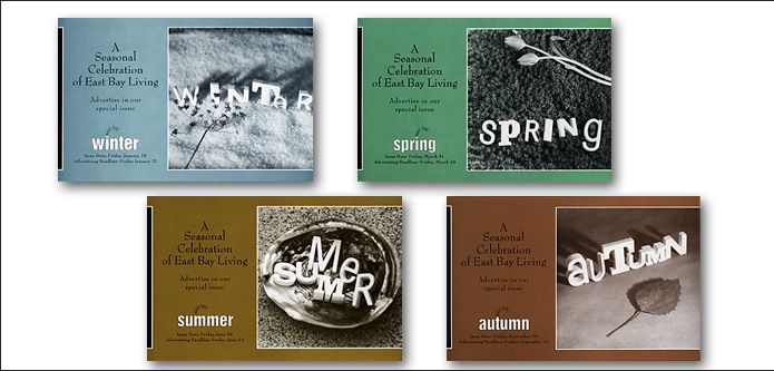

These cards promoted our seasonal special issues to advertisers. I started with the idea of the white plaster letters, and worked with photographer David Wasserman to create a campaign placing them in their seasonal surroundings. I chose metallic ink for the duotones to give the cards added depth.


